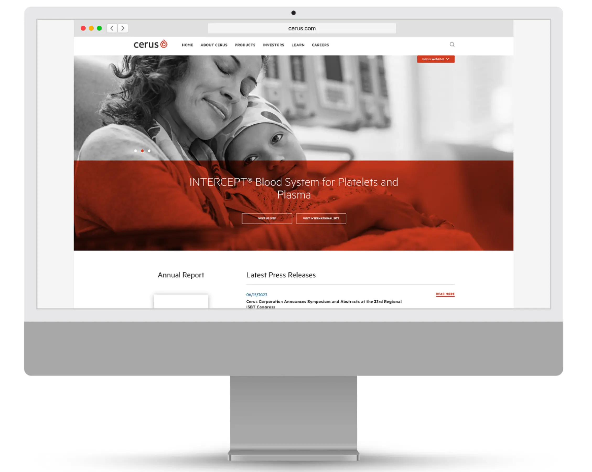
Reimagining a global blood products brand.

Our challenge and opportunity
A fresh, purpose-driven corporate story and visual identity were developed to help the company present and inspire as One Cerus.
Visual identity and brand system
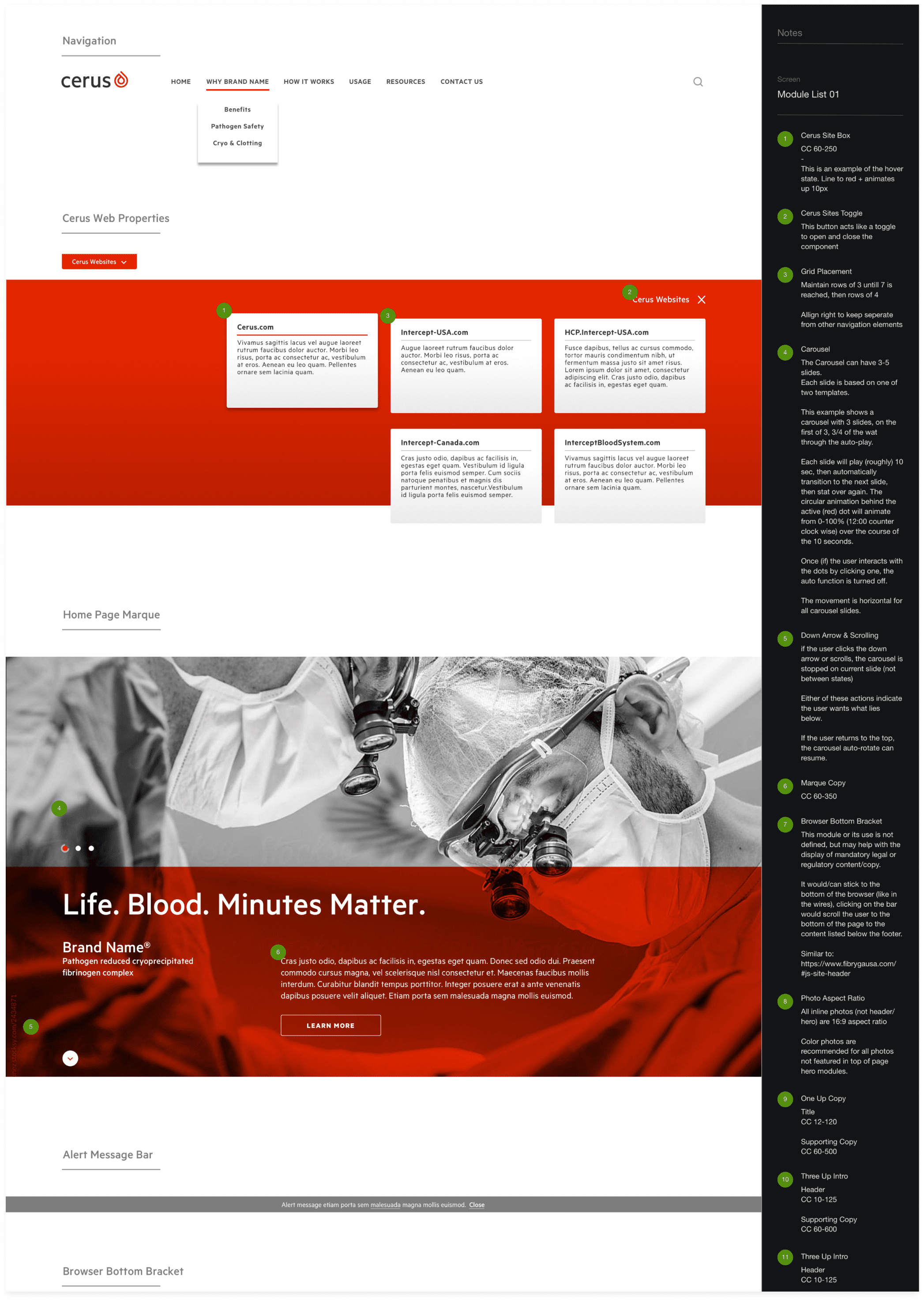
Corporate and product website design system
Brand launch support
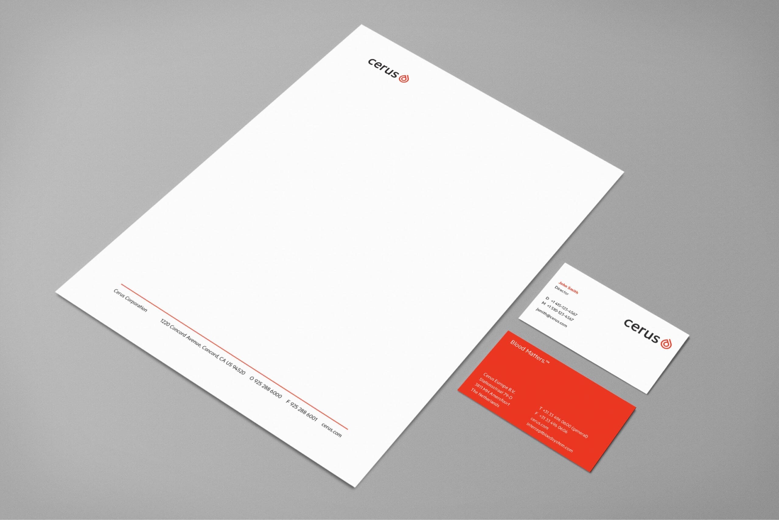
Collateral templates
Video asset development
Brand imagery library
Cerus’ new brand centered around the concept of “Blood Matters,” reflecting the company’s core business and the impact of its leadership role in safeguarding the world’s blood supply. The company’s new logo was strategically crafted to convey the firm’s global leadership in blood.

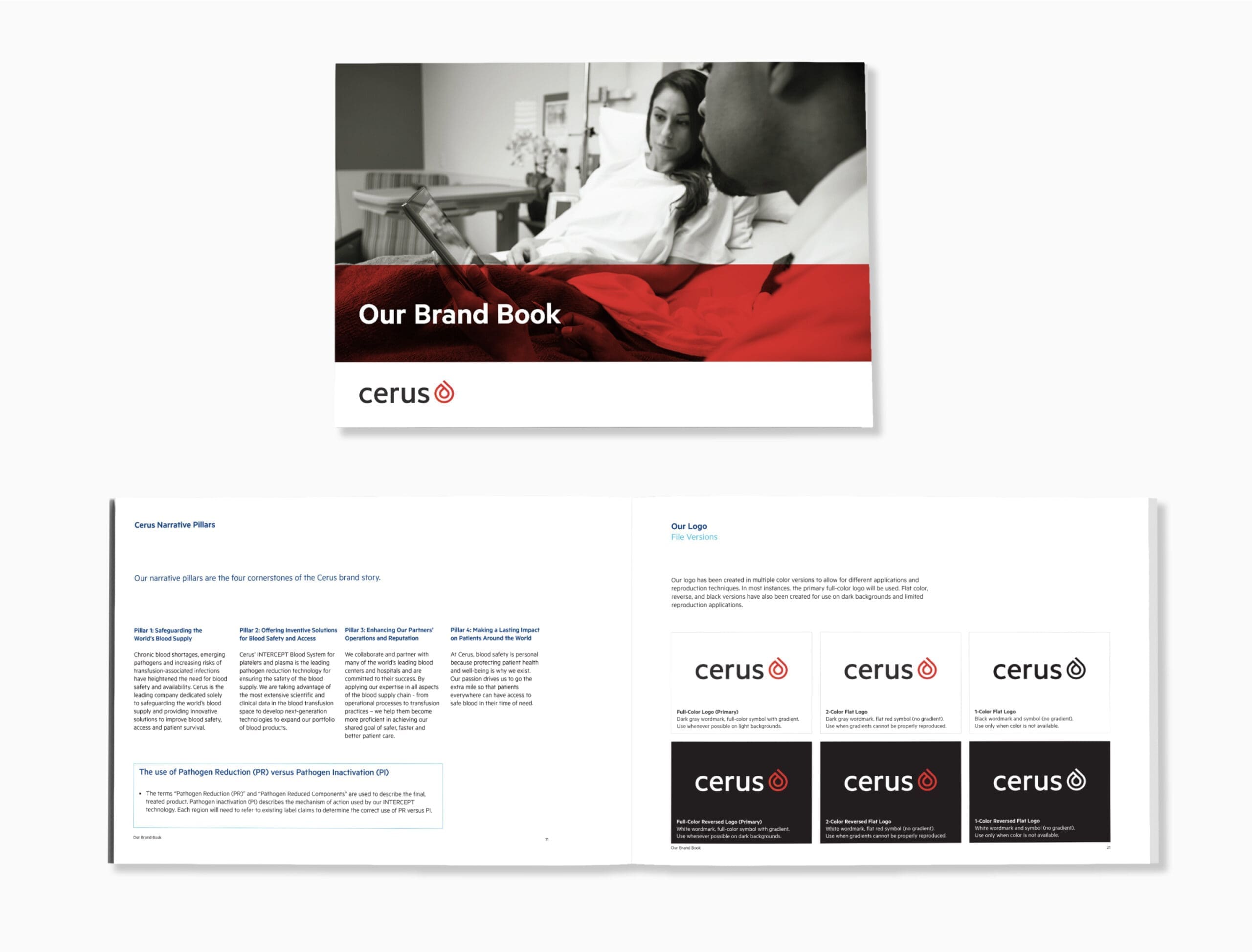
An extensive brand and messaging guide provided prescriptive guidance to Cerus marketers and their brand partners about consistently deploying the brand.
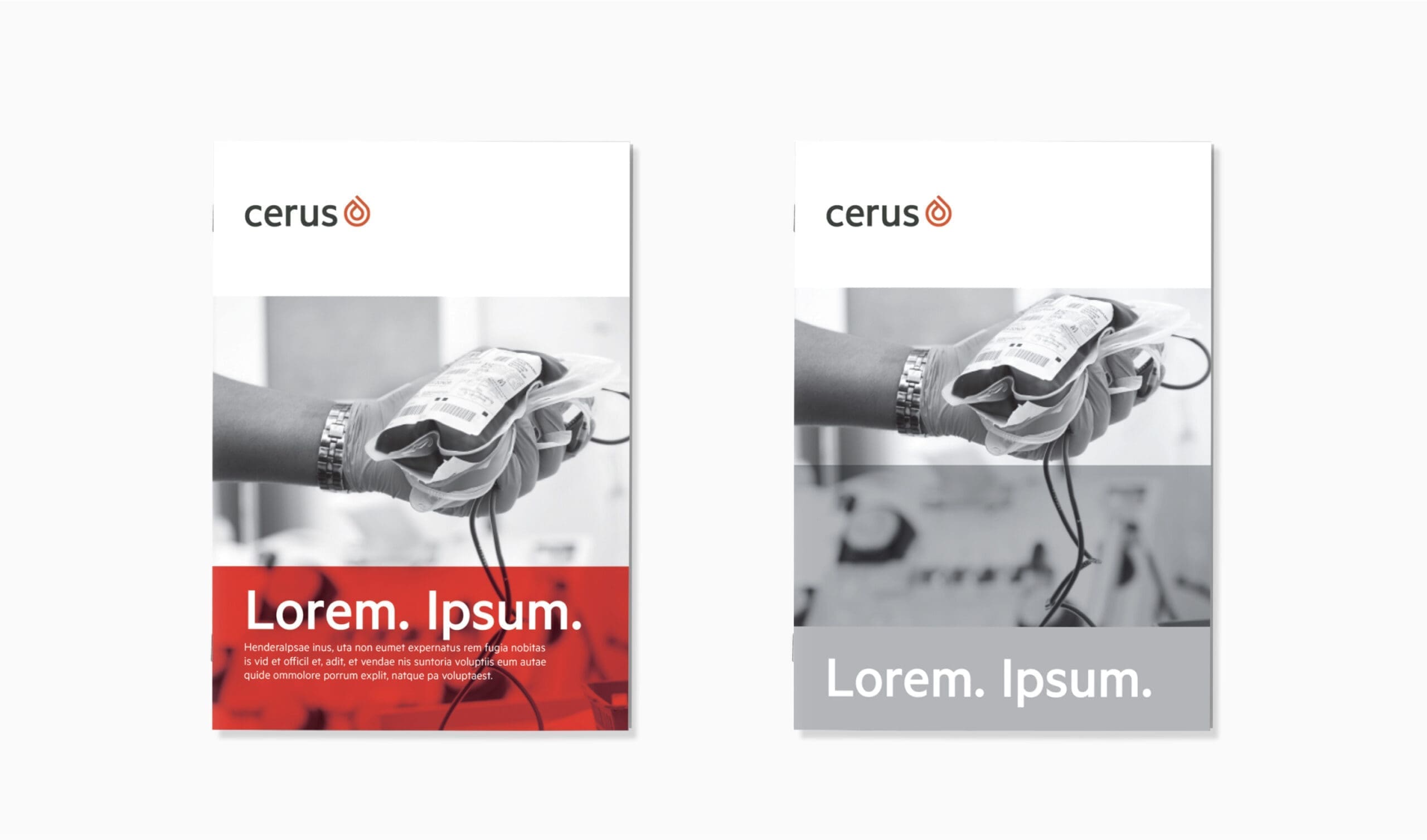
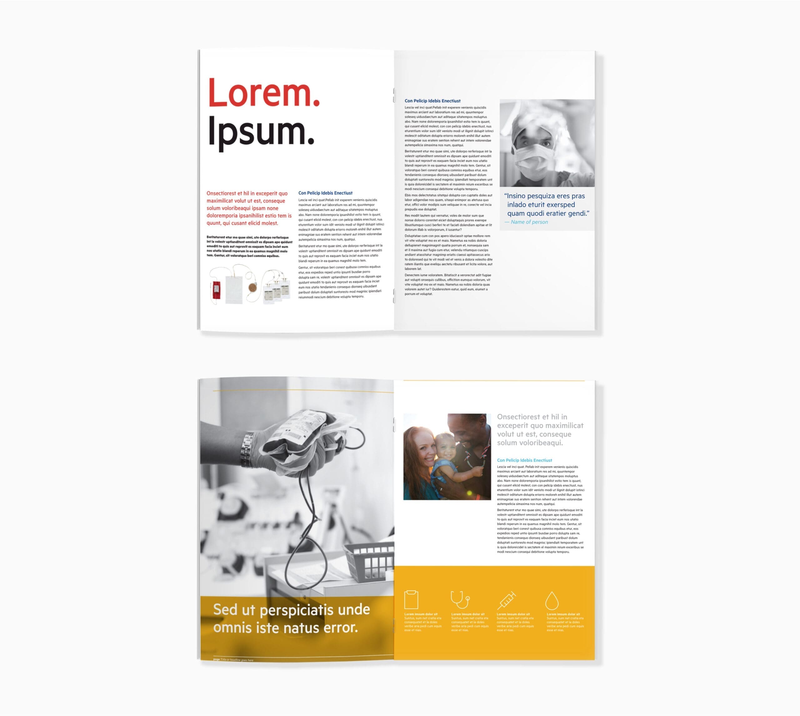
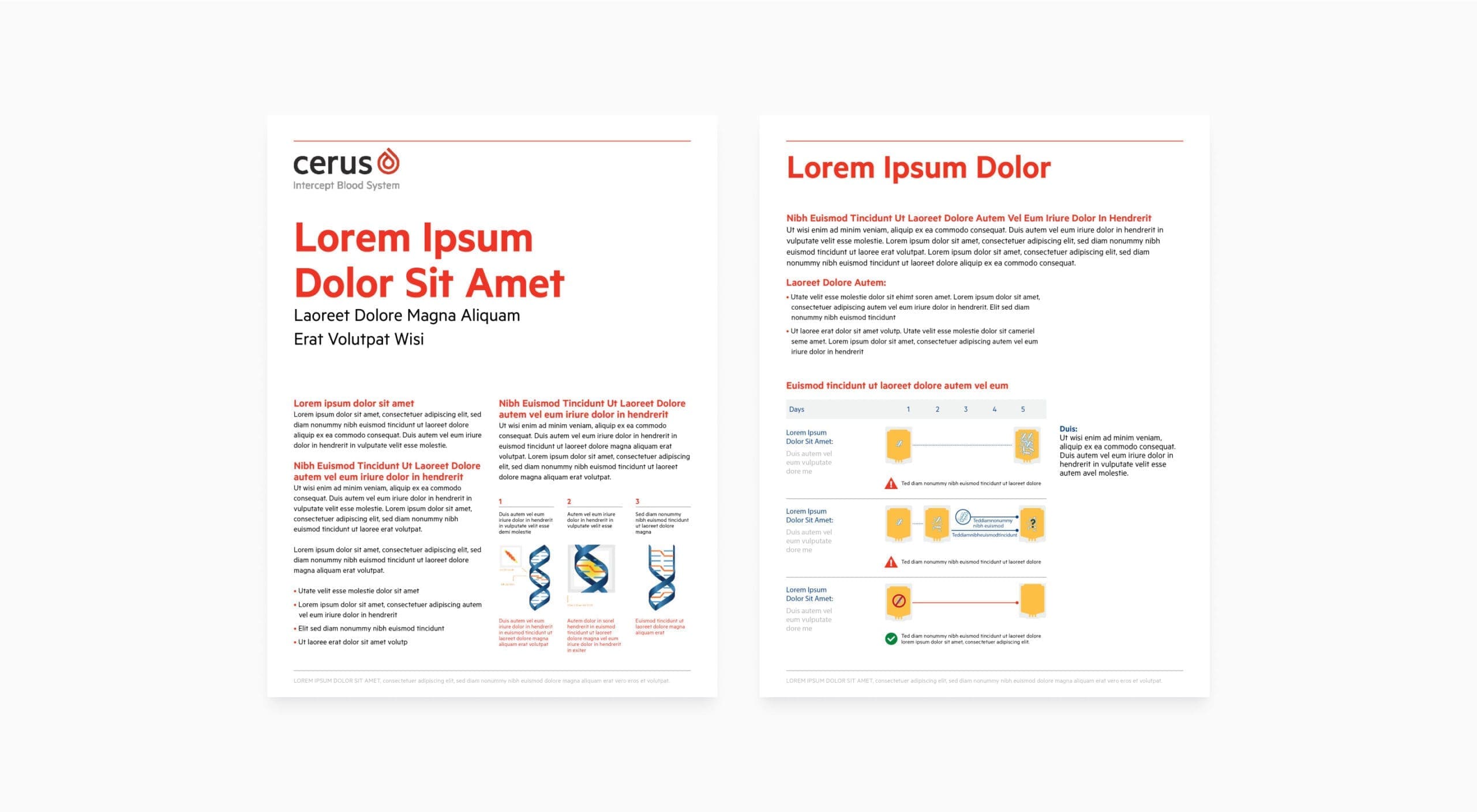
A suite of templatized promotional assets, including brochures, one-pagers and data sheets were developed to help power their efforts across the different Cerus products and regional efforts.
An internal environmental graphics series helped educate the Cerus team about the key principles of the updated brand.
Positioning and assets were created for Cerus’ new product INTERCEPT® Fibrinogen Complex.
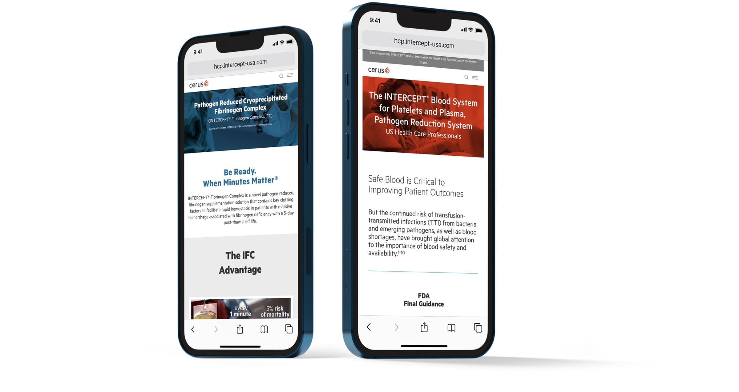
A website component design system allowed Cerus to build its digital presence efficiently with product-specific and regional websites.
